Another project I have going on is designing logos for a local brewery to go on their tap handles. One of their brews, Port City IPA....errr...its easier for me to just list my thought process:
Port City > Wilmington, NC > cape fear river > PORTS > FORTS > BRICKS! ...naturally.
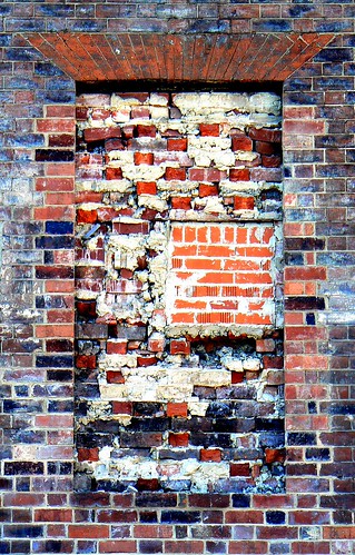
Downtown Wilmington is filled with old, brick architecture. There's even remnants of a large, stone fort wall from the civil war. AND there's tons of bricked up windows. Why brick up a window?! Yahoo answers claims there used to be a tax per window, so to save money the townspeople would wall them up!
So I went downtown and took some photos of brick archways and various masonry. I was inspired by Chris Dymond's above photo I found through a flickr search. It was the winning photo from a Walled Up Windows contest.
Here's what I came up with:


This comment has been removed by a blog administrator.
ReplyDeletehaha, I def still use Kermit slang...
ReplyDeleteIt's for the tap, right? So it'll be white with the brown and black and whatnot printed on it, right? Like a big white handle? I think that'll be great! People will ask "What's that white and brown one, The IPA?" They won't have to ask about what kind of beer it is cause it says it so nice and big! The bricks fade great. I'm rambling...
ReplyDelete